Finance — Product Design
Fintech Dashboard Suite

Overview
Designing real-time analytics and transaction management platforms for enterprise investment teams.
Role
Lead UI/UX Architect
Tools
Figma / React / Tailwind
Year
2025
The Challenge
The fintech dashboard needed to help investment teams work with large amounts of financial information without overwhelming them.
Some of the key challenges we identified were:
Managing high-density data:
Investment teams work with multiple data streams at the same time. Presenting too much information without a clear hierarchy made it difficult for users to identify the information that mattered most.Reducing visual noise:
The existing experience contained a large amount of financial data, charts, metrics, and transaction information. Users needed a more structured interface to quickly understand what was happening.Supporting faster decision-making:
Financial professionals often need to review information and react quickly. The dashboard needed to make important metrics and changes easy to identify.Creating a flexible workspace:
Different users have different priorities. The dashboard needed to provide a flexible layout where users could organize the information they use most frequently.

Process
Our team started by understanding how investment teams interact with real-time financial information and transaction management tools.
We explored the information hierarchy, dashboard structure, and different ways of presenting complex data without sacrificing usability.
Understand user workflows
Analyze existing dashboard interactions
Identify information hierarchy problems
Ideate a modular dashboard structure
Create interactive prototypes
Test and refine the interface
Solution
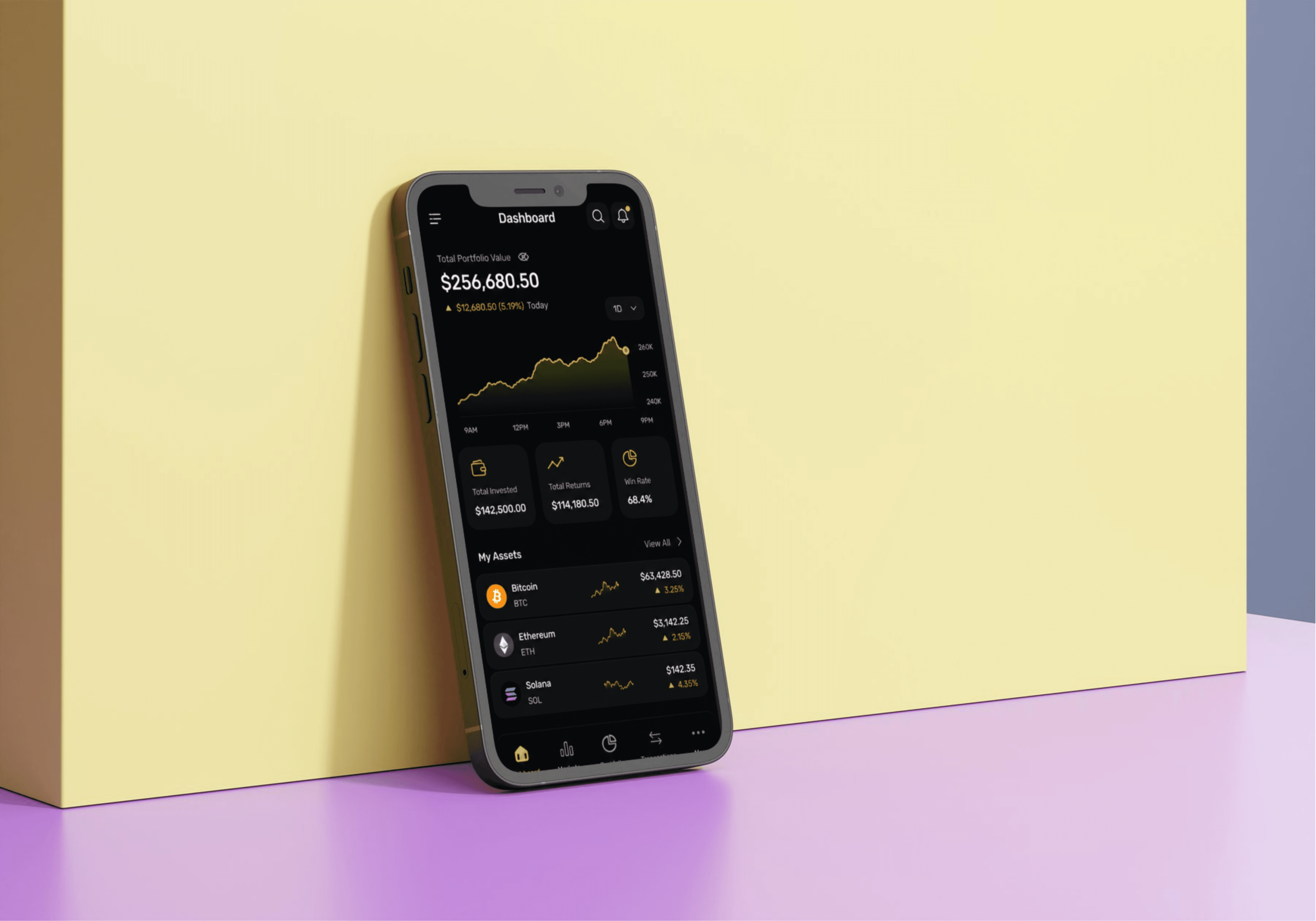
The fintech dashboard suite was redesigned around a modular system that allows users to organize financial information according to their individual workflows.
Modular Dashboard
Instead of presenting every metric in a fixed layout, the dashboard uses customizable widgets that allow users to prioritize the information they need most.
Clear Visual Hierarchy
Important financial metrics, transaction information, and real-time updates are visually separated so users can scan the dashboard quickly.
Customizable Widgets
Users can arrange dashboard components around their specific workflow, creating a more personalized workspace.
Real-Time Analytics
The interface provides a structured way to monitor financial activity and analyze changing data without overwhelming the user.
Transaction Management
Transaction-related information is organized into clear sections, making it easier for users to review and manage financial activity.

Process
The project demonstrated how a complex financial dashboard can become easier to use when information is structured around the user's workflow.
The final concept focused on:
Real-time financial analytics
Customizable dashboard widgets
Clear information hierarchy
Reduced visual noise
Transaction management
Modular layouts
Dark UI for data-heavy workflows
Faster access to important information