E-commerce · UI/UX
E-Commerce Mobile Experience

Overview
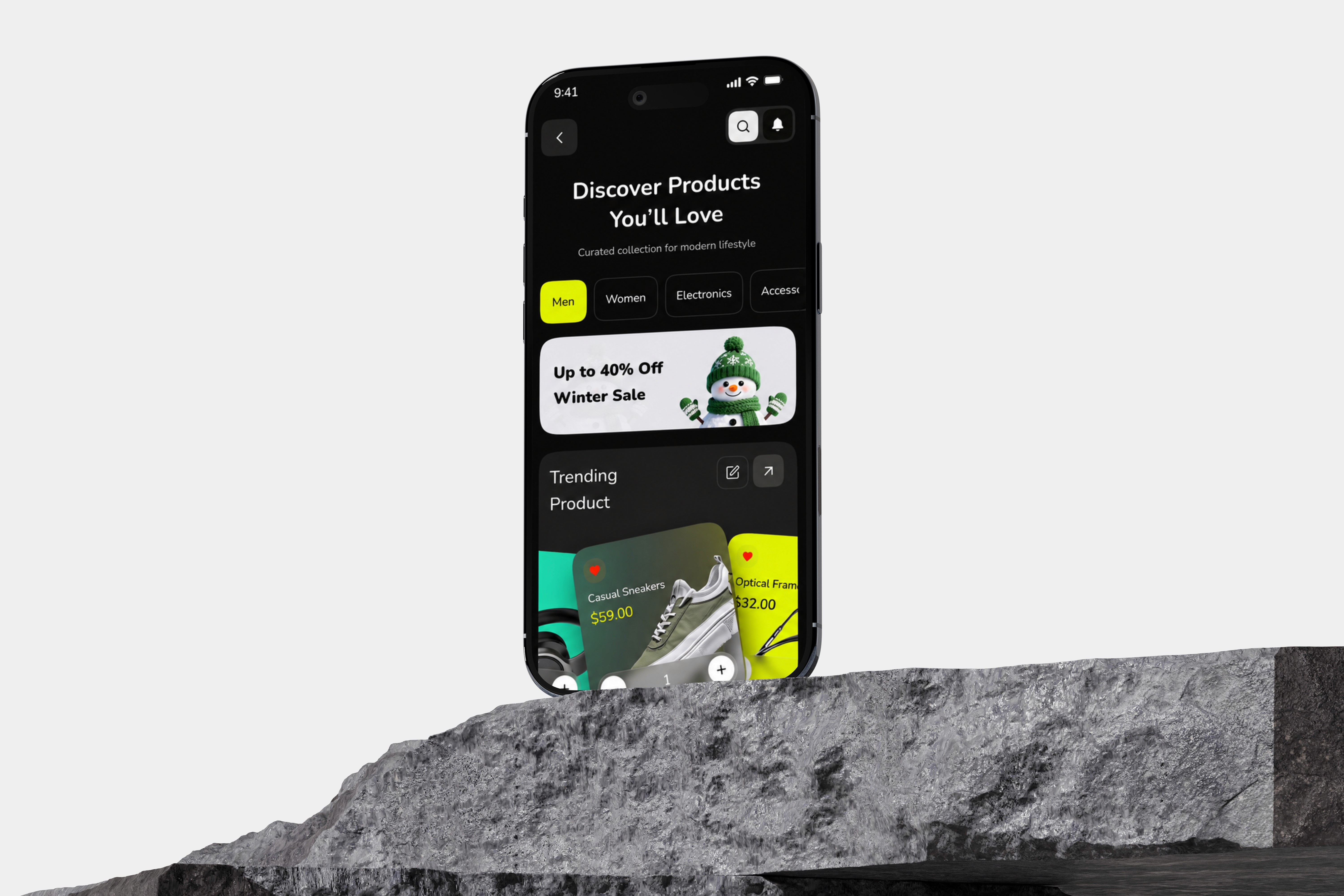
A complete redesign of a modern shopping experience focusing on high-converting checkout flows and micro-interactions.
Role
Product Designer & UX Researcher
Tools
Framer / Figma / Webflow
Year
2026
The Challenge
The existing mobile shopping experience made it difficult for customers to complete their purchases quickly. The checkout process contained multiple steps, mandatory account registration, and a lengthy address form, creating unnecessary friction on mobile devices.
Reducing checkout friction:
The checkout journey required users to complete multiple steps before reaching payment. Mandatory account creation introduced additional form fields and password requirements, making the process longer than necessary.
Simplifying mobile forms:
Entering delivery information on a mobile device can be time-consuming. The existing five-field address form created additional interaction cost and slowed down the checkout experience.
Improving mobile performance:
Slow loading and delayed interface transitions made the experience feel less responsive. We needed to make important interactions feel immediate while allowing secondary information to load progressively.
Creating a clearer purchase journey:
The experience needed a stronger visual hierarchy so users could easily understand their products, pricing, payment options, and order status.

Process
We started the project by understanding the existing shopping journey and identifying where users experienced the most friction. We analyzed the checkout flow, reviewed the key interaction points, and explored opportunities to simplify the experience across mobile screens.
Understand the existing shopping journey
Identify checkout friction points
Synthesize findings and define UX priorities
Ideate simplified checkout solutions
Create interactive prototypes
Test and refine the experience
The primary design direction was to reduce unnecessary steps while keeping the shopping experience clear and reassuring.
Solution
The redesigned e-commerce experience focuses on creating a seamless path from product discovery to purchase. We introduced a simplified checkout experience that allows shoppers to use familiar express payment methods instead of being forced through a lengthy registration process.
The redesigned experience includes:
Express Checkout
One-tap payment options help customers bypass unnecessary account registration and move directly toward completing their purchase.
Simplified Order Summary
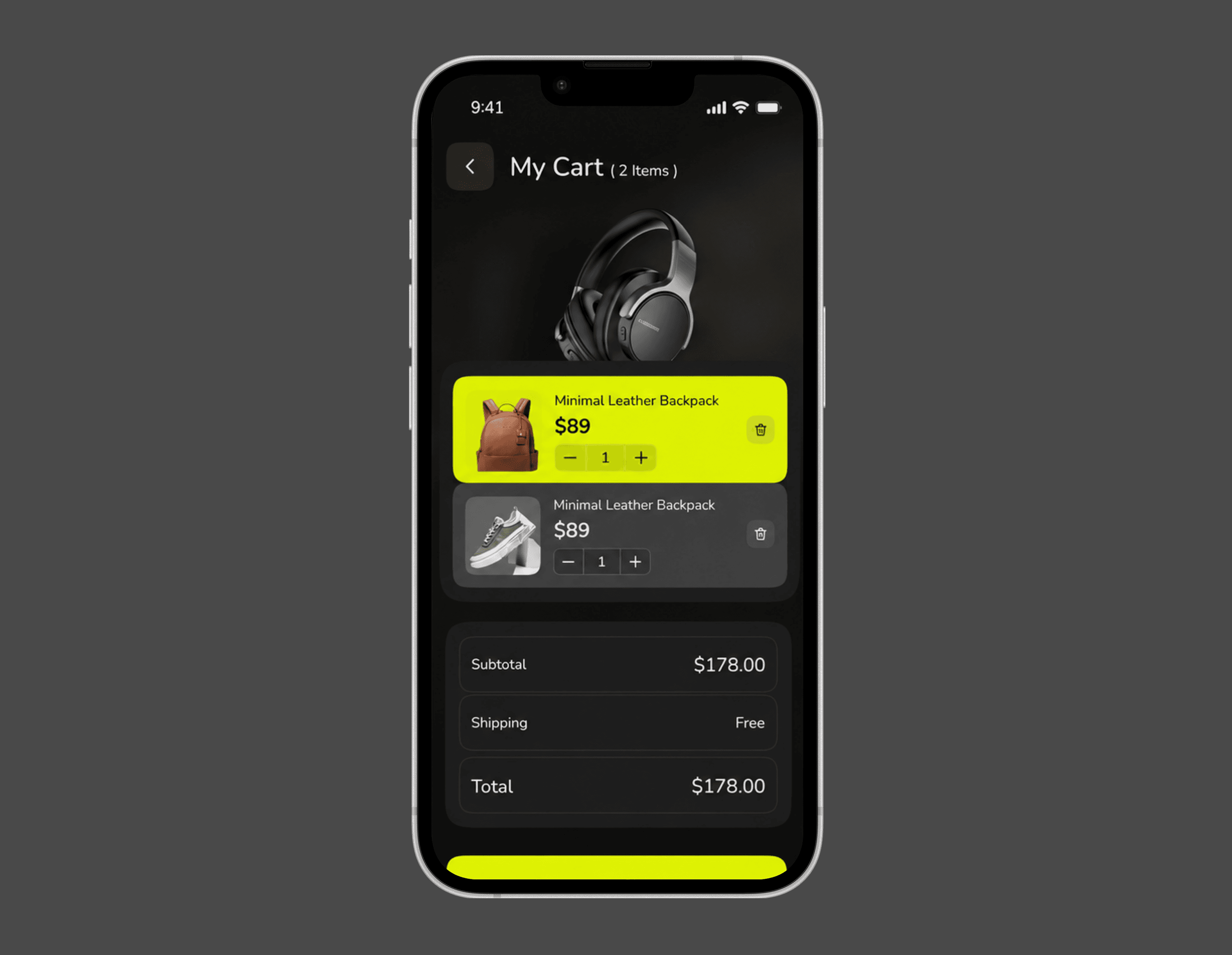
The cart and checkout experience clearly communicate the selected product, quantity, variant, price, shipping information, and final total without overwhelming the user.
Instant Purchase Confirmation
After payment, users immediately receive confirmation that their order has been successfully placed. Delivery and tracking information can then be displayed progressively.
Progressive Loading
Instead of making users wait for every piece of information, secondary content can load in the background while the primary interface remains responsive.
Mobile-First Interaction
Buttons, cards, navigation, and checkout actions were designed specifically around touch interaction and smaller mobile screens.
Process
The project demonstrated how removing unnecessary interactions can create a more effective e-commerce experience.
The final concept focused on:
Fewer checkout steps
Express payment
Simplified forms
Clear product information
Immediate purchase feedback
Progressive loading
Mobile-first interactions